Sportief Besteed Groep
Dec 2024 - Dec 2025
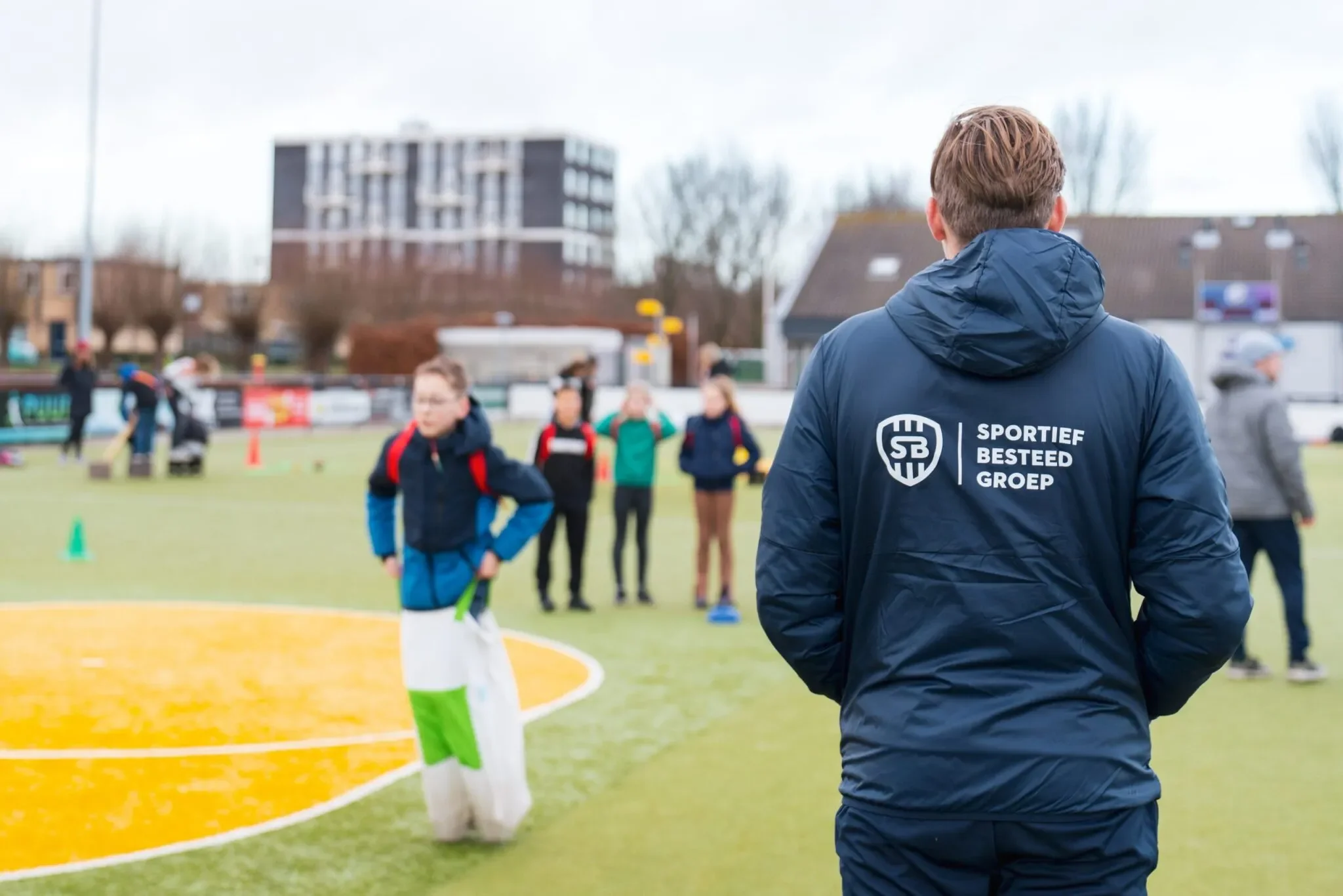
At SBG, we believe that movement is more than just sport. It's the foundation for vitality, connection, and social change. Driven by our passion for people and our experience in the social domain, we work passionately every day on projects that truly make a difference. For young and old, in neighborhoods, schools, and organizations. We are more than just an organization: we are a partner that energizes, motivates people, and makes impact visible.
SBG offers various services and products, such as the SBG app, where residents can easily register for activities offered by various partners. It's therefore crucial that all target groups are addressed.
UX Tools: Figma, Power bi, Excel
UX Methods: Information structure, Data Analysis, Critical thinking, User research, User testing, Workshops, Userflow diagram
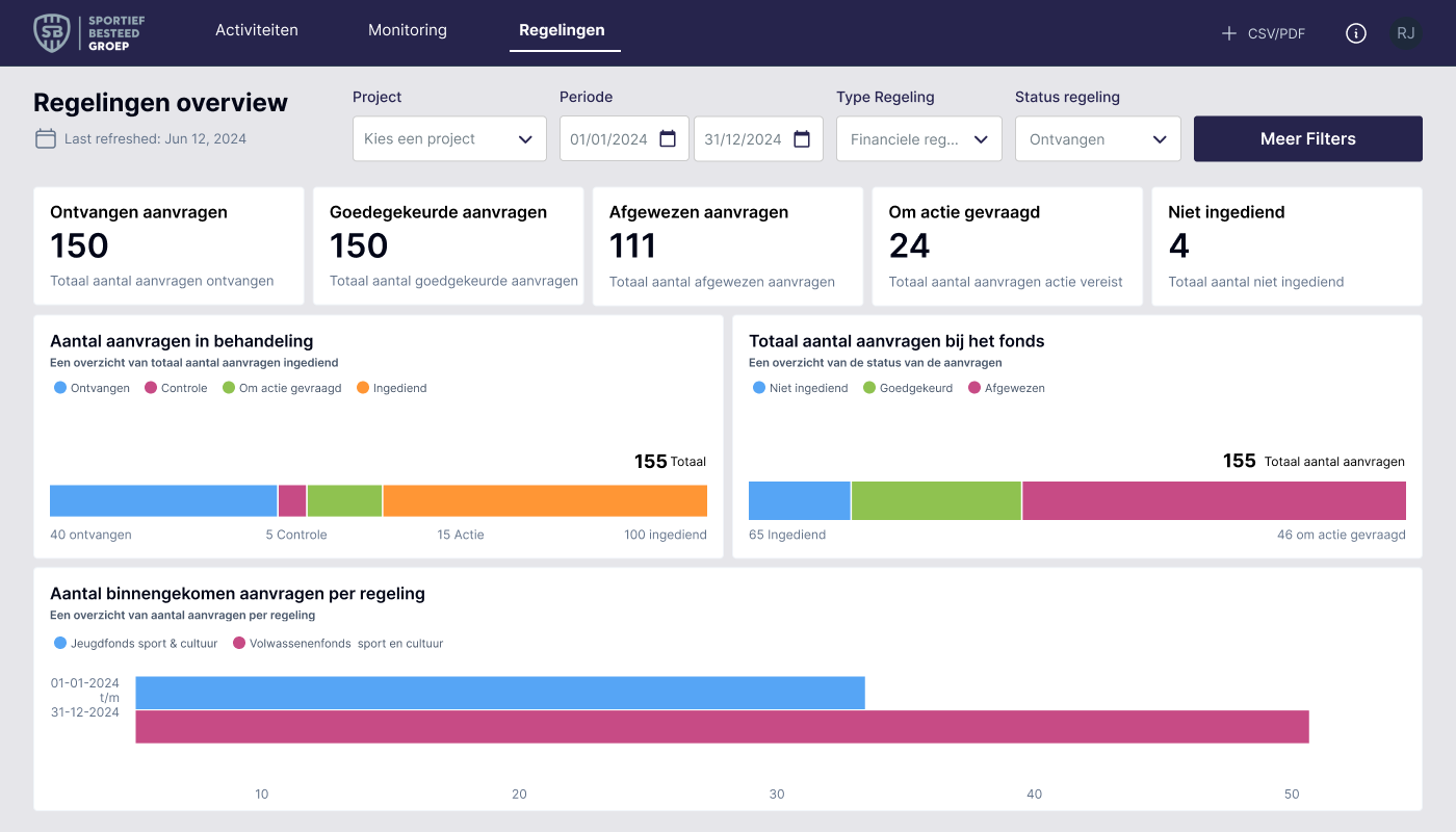
SBG Dashboard
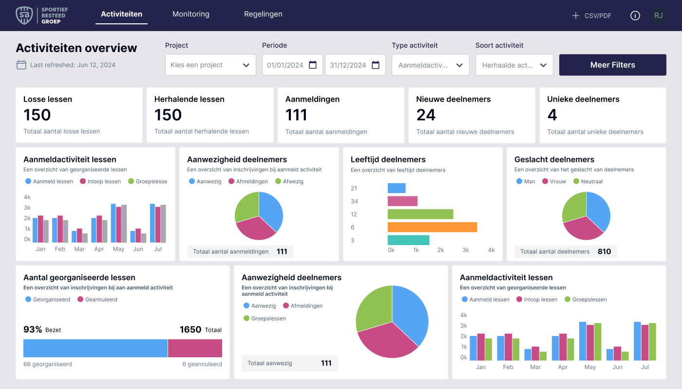
The SBG app contains a wealth of information. It includes how many people participate in an activity, who they are, where they come from, their age and gender, and the activities they've participated in. The idea is to create a clear overview of all this data. In practice, SBG sports leaders often use this data for their reporting to municipalities. This allows them to analyze and respond to trends, as well as assess their reach within the municipality.
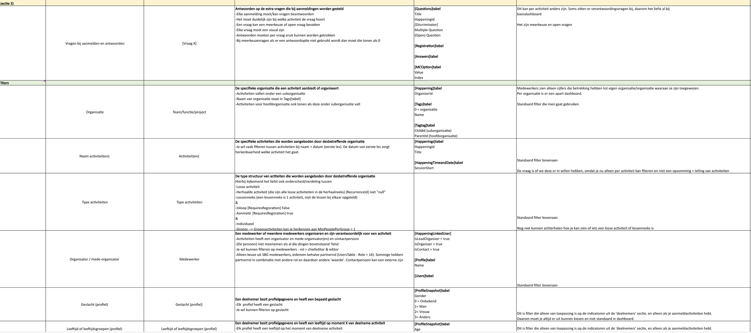
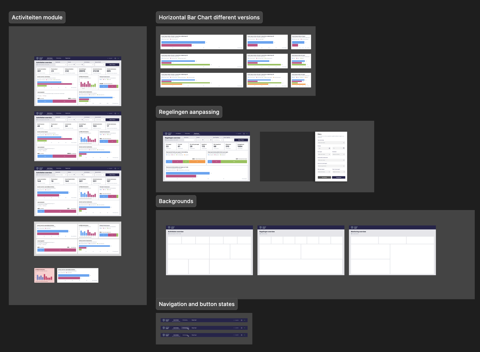
My challenge was to transform this Excel document with its KPIs into a visual representation. I had already considered developing this using Power BI software, but my UX design skills weren't up to par. Therefore, I sought out a suitable partner specializing in Power BI who could translate my design into a working product.
Together with this partner, we specified the integrations and explored the available options within Power BI. To test actions during our process, I also enlisted the help of internal colleagues who work as sports instructors. These users can verify the accuracy of the KPIs and display reliable data on the dashboard.
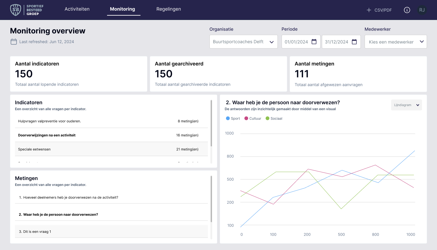
The SBG app contains several modules, and while developing the activity dashboard, we internally recognized the need for a dashboard for both the monitoring and regulations modules. Based on the process for the first dashboard: Excel > sketch > test > visualization > implementation, we also developed the following two dashboards.
Implementing new features
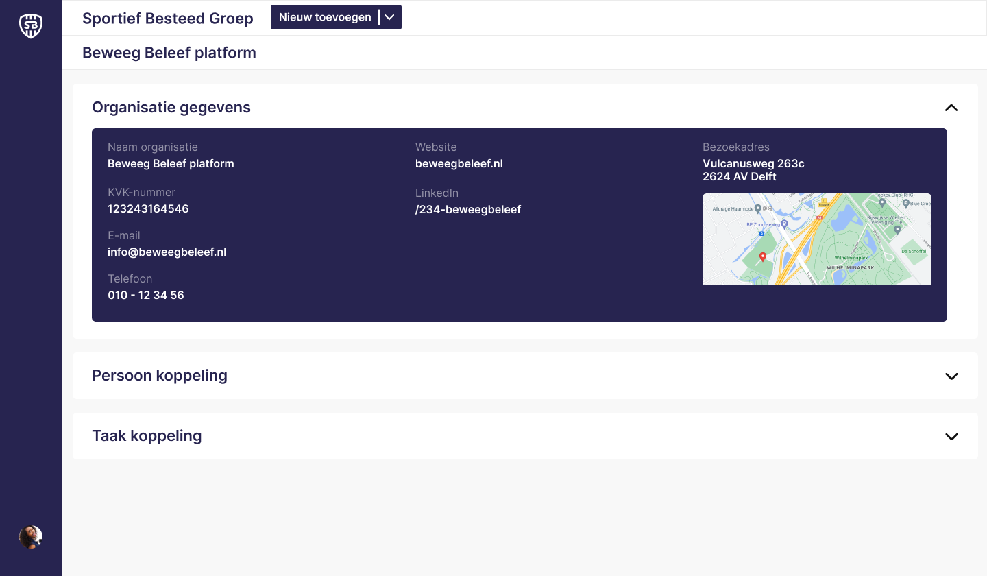
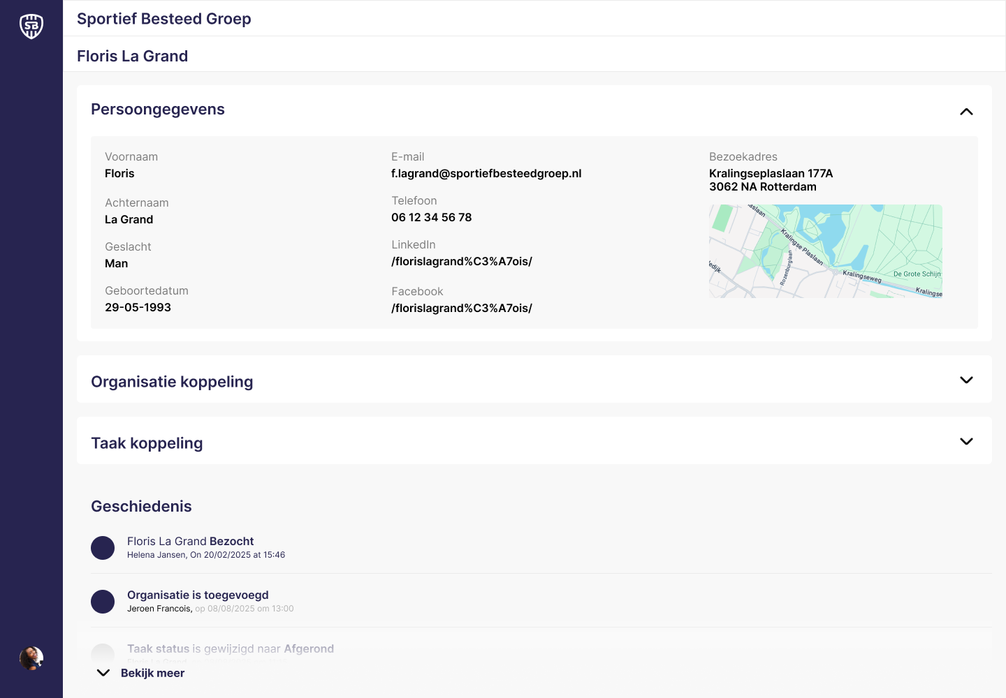
To support the SBG app, there's also a back office. This serves as the system where the app is managed. This includes creating activities, managing participants and profiles, as well as applying for financial arrangements and monitoring participants, as I mentioned earlier in the dashboard project.
My main focus was on improving the workflow of the user in the backoffice. An idea was once conceived to launch a module where employees could take internal notes with various affiliated partners. This would allow us to maintain an internal overview of communication and agreements made.
To achieve this, I first assessed employee needs for this module and whether it aligned with the product owner's vision. Based on these results and several iterations, I developed the CRM module.
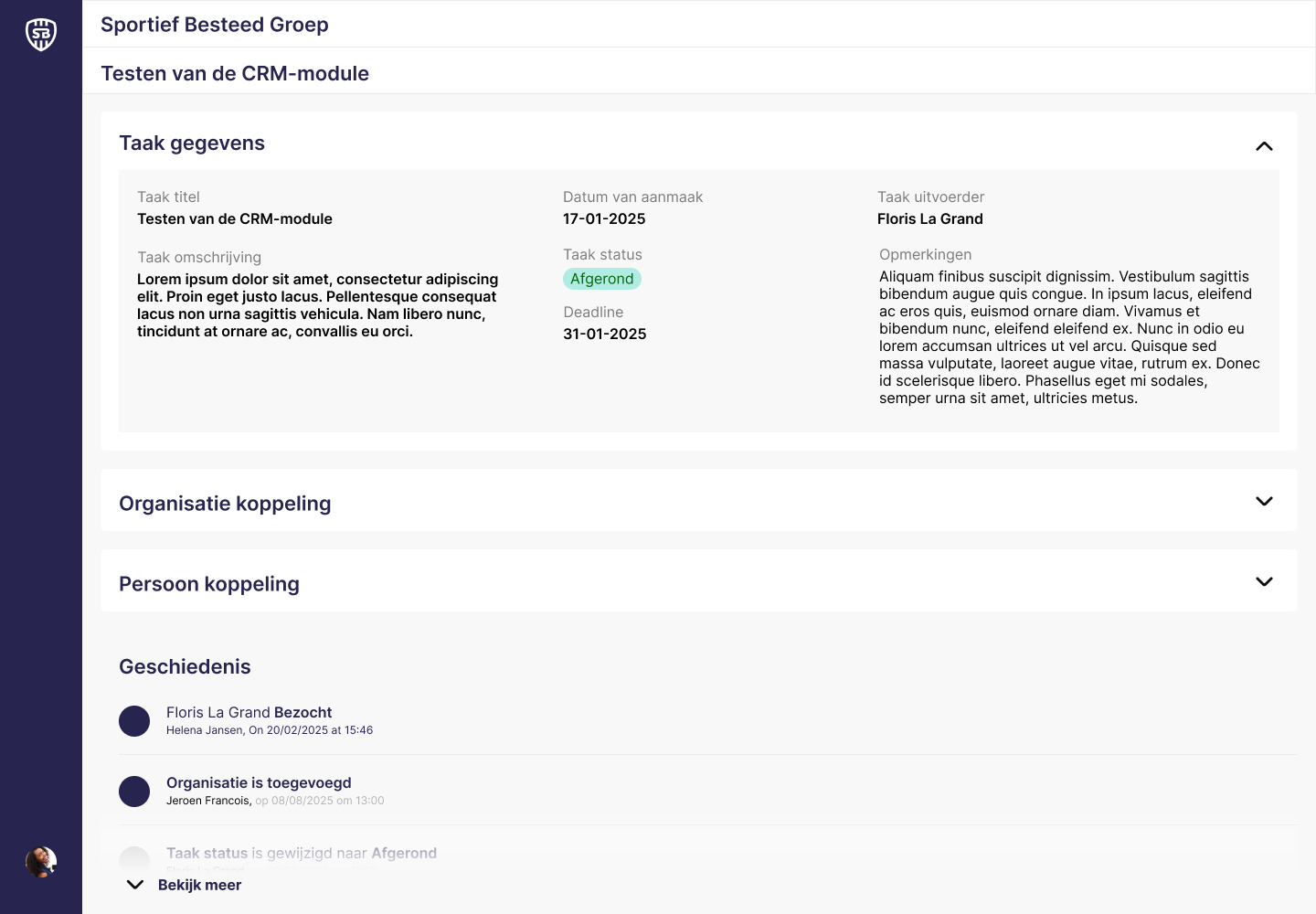
This module is designed to easily record communication and agreements made with a partner. Employees can create an organization and link individuals (employees) to it. All information and associated tasks can be found on the organization page. The tasks serve as a means of communicating insights, agreements, and communication. Based on the latest iteration, I added a history block where employees can see who has done what and which tasks have been created or modified.
Improving the User Workflow
To enable effective collaboration across multiple platforms, it’s essential that each system integrates seamlessly. This requires carefully designed processes with minimal room for user error.
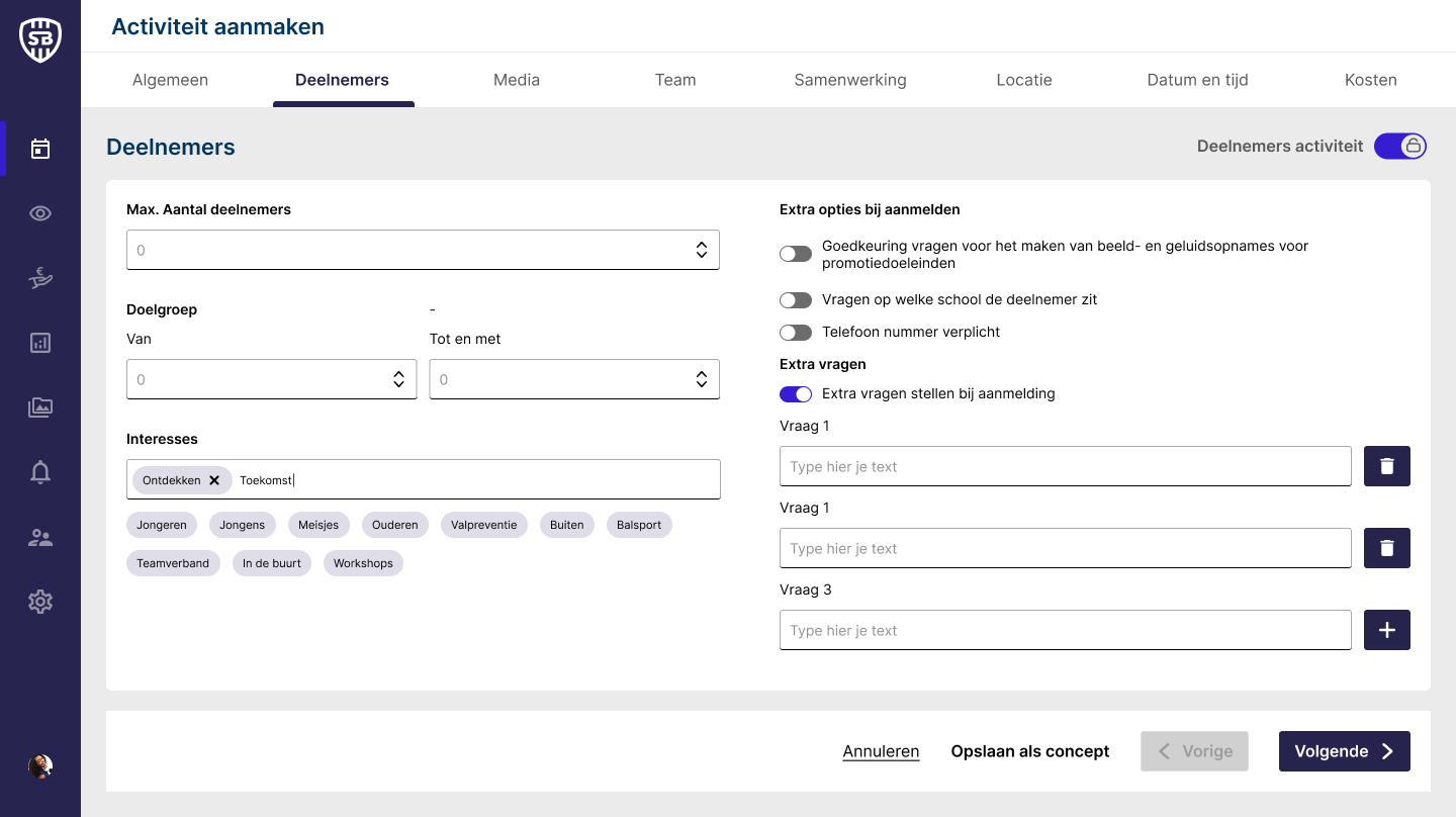
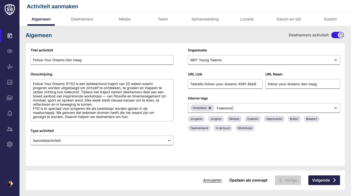
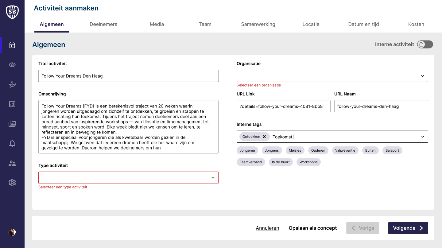
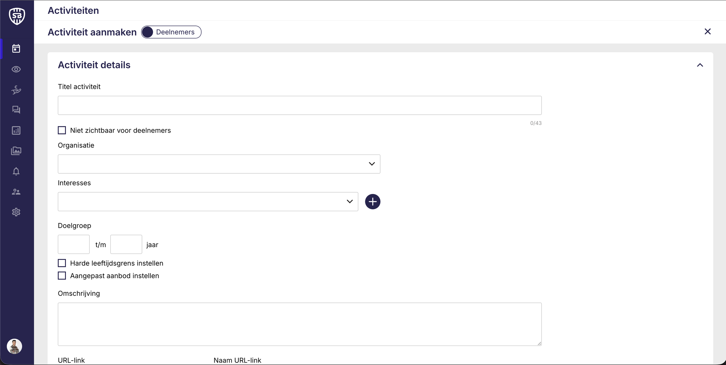
When creating a new activity, users must complete a multi-step flow divided into collapsible sections where they can input and edit details. However, during usability testing, we identified a major pain point: users struggled to maintain an overview of the form’s validation status.
After entering details, the Publish button appeared active even when some fields were incorrectly filled in, leading to confusion and failed submissions. Additionally, the back-office interface provided no clear feedback on which specific fields required correction.
These findings revealed a key opportunity to improve the error prevention and feedback mechanisms within the activity creation flow. Users need clearer guidance and real-time validation to confidently complete and publish their activities.
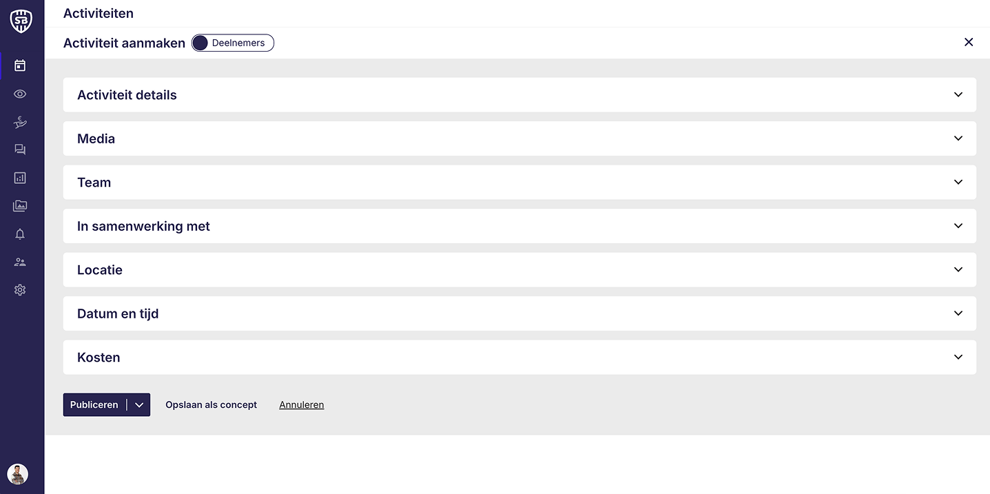
Design Solution: Streamlining the Activity Creation Flow
To enhance the user experience, I restructured the existing accordion-based form into a step-by-step flow with a clear progress indicator at the top. The first two steps are now split into General Information and Participants, providing a clearer distinction between the different sections of the form.
In addition to the top indicators, I introduced a persistent bottom navigation bar, allowing users to move between steps, save their progress as a draft, or cancel the activity at any time.
The core strength of this design lies in guided interaction and real-time feedback. Each time the user clicks ‘Next,’ the form validates input fields and highlights any errors directly on the relevant field, providing immediate clarity and reducing friction. The ‘Next’ button remains visible at all times, accommodating optional fields while maintaining consistent navigation.
This approach not only reduces user errors but also creates a more intuitive, efficient workflow, enabling users to complete and publish activities confidently.